When writing your book you must keep in mind that regardless of how attractive your cover is and how strong your story might be, choosing the right arrangement of fonts, point size, and line length can make or break your book.
The goal of choosing the right font for your book is to create a readable, consistent, and visually satisfying reading flow that works invisibly, without the awareness of the reader.
Similar to the book story and cover, when choosing the right font for your book, you should always keep your target audience in mind. Depending on whether the work is fiction, non-fiction, educational, religious, scientific or commercial writing, each of them have different characteristics, target audiences and require appropriate corresponding fonts.
Before going any further…
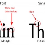
You should keep in mind that all fonts can be divided into the two main categories of Serif Font and Sans Serif Fonts. The word ¨Serif¨ describes the small features at the end of each letter and Sans Serif (often used in the printing industry) refers to fonts without “serifs”. There are many varieties between Serif and Sans Serif font groups and both groups contain fonts that are safe to use for large amounts of text.
In general, Serif Fonts are considered easier to read in longer text amounts and printed works like books and newspapers.
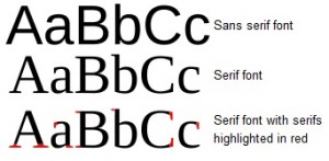
Time Roman / Time New Roman
This might be tempting to use, because it has been around for a very long time. This font was originally employed heavily with newspapers back in the 1930´s. The font sets very tight and can give the look of a very dark and solid block, which is not necessarily recommendable for a book.
Font Family describes variations of font types within the same family. As a general rule you should not use more than 3 fonts in your book, and if you do, make sure you use fonts from the same font family. Choose one font for the text of your book (main text), a different style for chapter titles and 3rd if needed for photo captions and graphics.
Font Family: Book Antiqua
Normal: Book Title
Bold: Book Title
Italic: Book Title
Recommended fonts for your book:
:: Palatino Linotype :: Book Antiqua :: Georgia
:: Goudy Old Style ::Bookman :: Adobe Garamond Pro
:: Century Schoolbook
Font Size, Most paper books are printed in 10 or 11 point size but depending on the font it might require larger or maybe even smaller size. Don’t be afraid to add a half-point to reach the optimal size. It’s important that the norm size for younger readers between 5 to 10 year olds is between 12 and 14 point.
If you like to learn more about font history check out I Love Typography it´s a great site for any font fanatics!


 13 / April / 2012















 Recent Comments

You put together quite a few great ideas within your posting,
“Typography- choosing the right font for
your book | Bubok Blog”. I am going to you should
be coming to your web site soon. Thank you -Elton